The Drop a Hint feature lets users not so subtly, drop hints to someone they want a gift from. This feature was introduced around the holiday season help streamline any guessing games.
.png)
Ana Luisa is newer to the market compared to most in the plated jewelry brands and as went through a few makeovers to discover and establish its iconic look. After an attention grabbing facelift, it was time to dig deeper and solidify its connection with customers. As the second ever UX designer at the company, essentially a part of the pioneer team, it was up to us to come with with an innovative way to increase engagement around the holiday season, or rather known as gifting season.
As the new(er) face to market, it was vital to keep up with the trends but also keep the brand created ways to stand out rather than following the status quo of fellow competitors.
.png)
Product Cards: This announcement design allows Ana Luisa to highlight the feature for users without being too aggressive.
The intention was to design to blend in, using a softer color palette for a more organic feel. It is meant to catch customers eyes not shout at them. Because this is an e-commerce shop, we have to think about the mood of the user. In this case, because this feature is not pushing a paid product, we opted for a more playful approach. The holidays are stressful enough.

Iconography: Created icons to signify the feature on the product pages for two reasons:
- One, for the user to access the feature easily, specifically on mobile view and -
- Two, to potentially grab the attention of users aware of this feature. Giving it real estate akin to the standard "favorite" button makes it more visible.

Subtle USP: Created a USP to add another area of awareness.
Through quarterly user interviews with real customers, we were able to derive that returning users often refer to this section to look at how many reward points they would collect from purchasing this piece. From here, we operated under the assumption that this is great real estate to capitalize on.

Pop-up: Created a pop-up to drive home awareness.
What is an e-commerce site without pop-ups? Truthfully, they tread the fine line between useful and annoying. With that in mind, we limited the pop-ups on the website in hopes of providing a less annoying experience. In addition, we went with fun terminology to provide a bit of human touch.

I started with competitive analysis, looking at two established brands, confidential, and another new face to the market - also, confidential. It was important as a UX designer to get a more well rounded view of the digital market so I expanded my scope to include three other companies, (sigh) confidential, that were derived from our user interviews. After coming to a conclusion, I put together mocks that were discussed with our COO, Lead PM, Copywriter, Senior Engineer and Senior Designer.

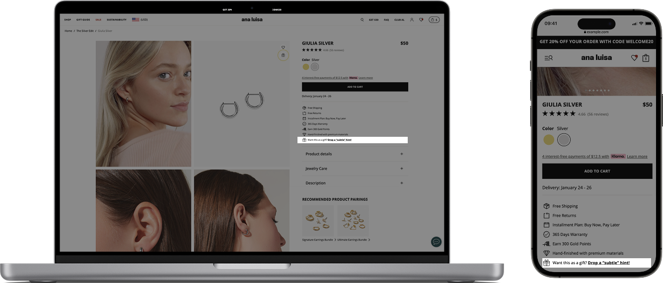
Product Cards: Words can go a thousand miles:
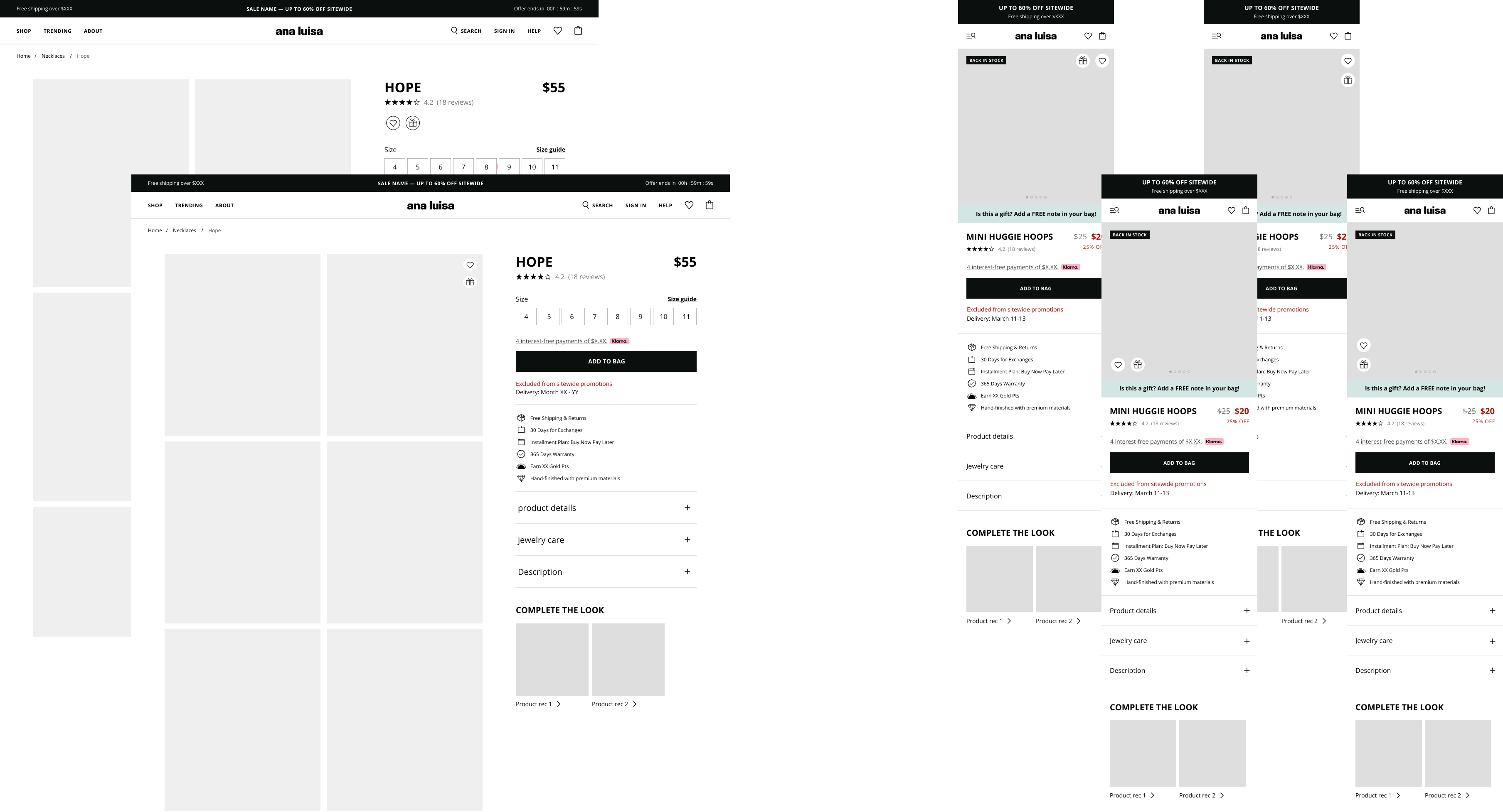
While the contents are confidential, I can share the process in low-fi format. Just imagine the long grey rectangles are words ;) I worked with the copywriter on a few ideas and variations, over 10+ ideas and narrowed them down by feasibilty. Would the text support the image well or would itcreate visual clutter? What words created the most impact?

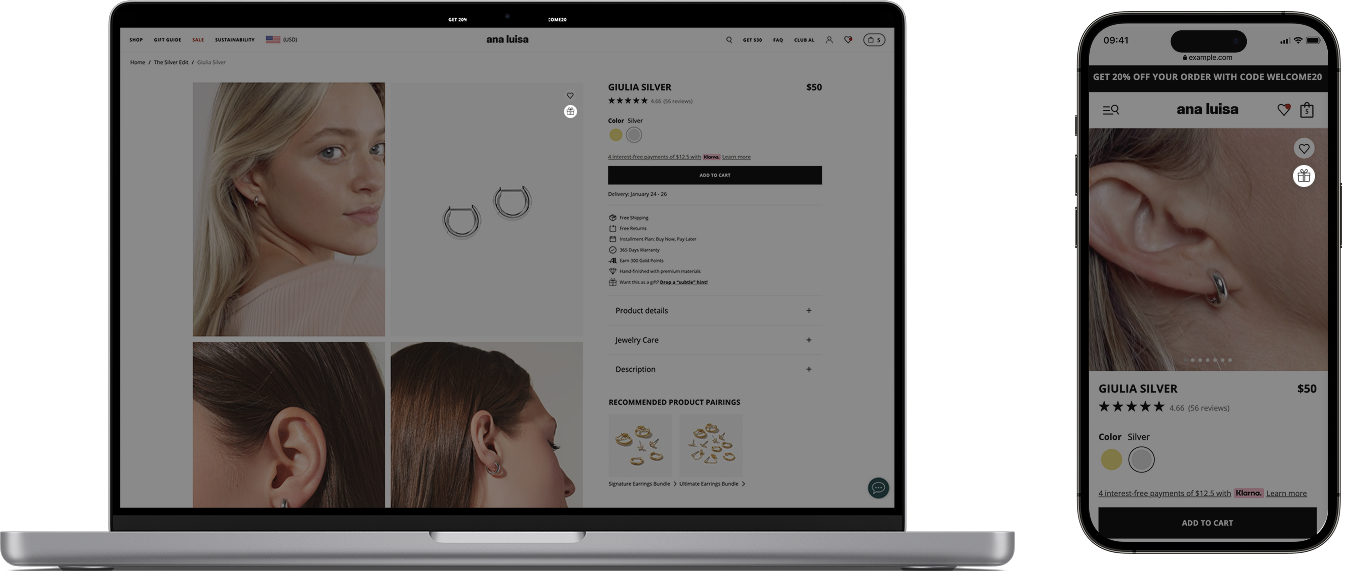
Iconography: intuitive placements matter. A lot.
Icons are like the accessories to an outfit. It's not the main point but it's the finishing touch to the look, or in this case, the experience. We tested a few common icon placements found on over ten different ecommerce platforms and websites, including popular powerhouses like Amazon and determined the most commonly used real estate. For mobile, we had to mindful to not negatively impact the product image, and we did this through collaborating with the creative team to test the final two icon placements against a variety of photos.
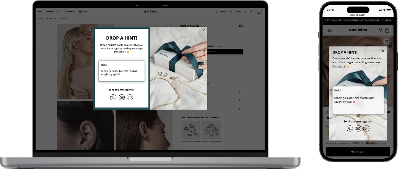
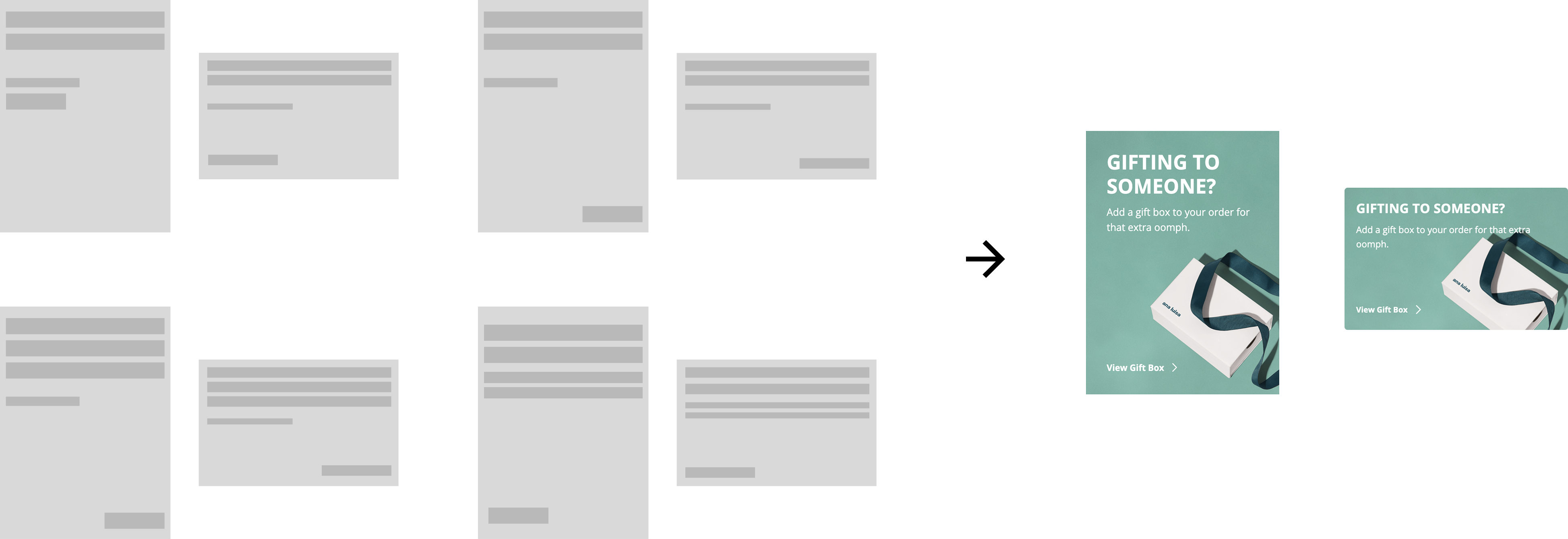
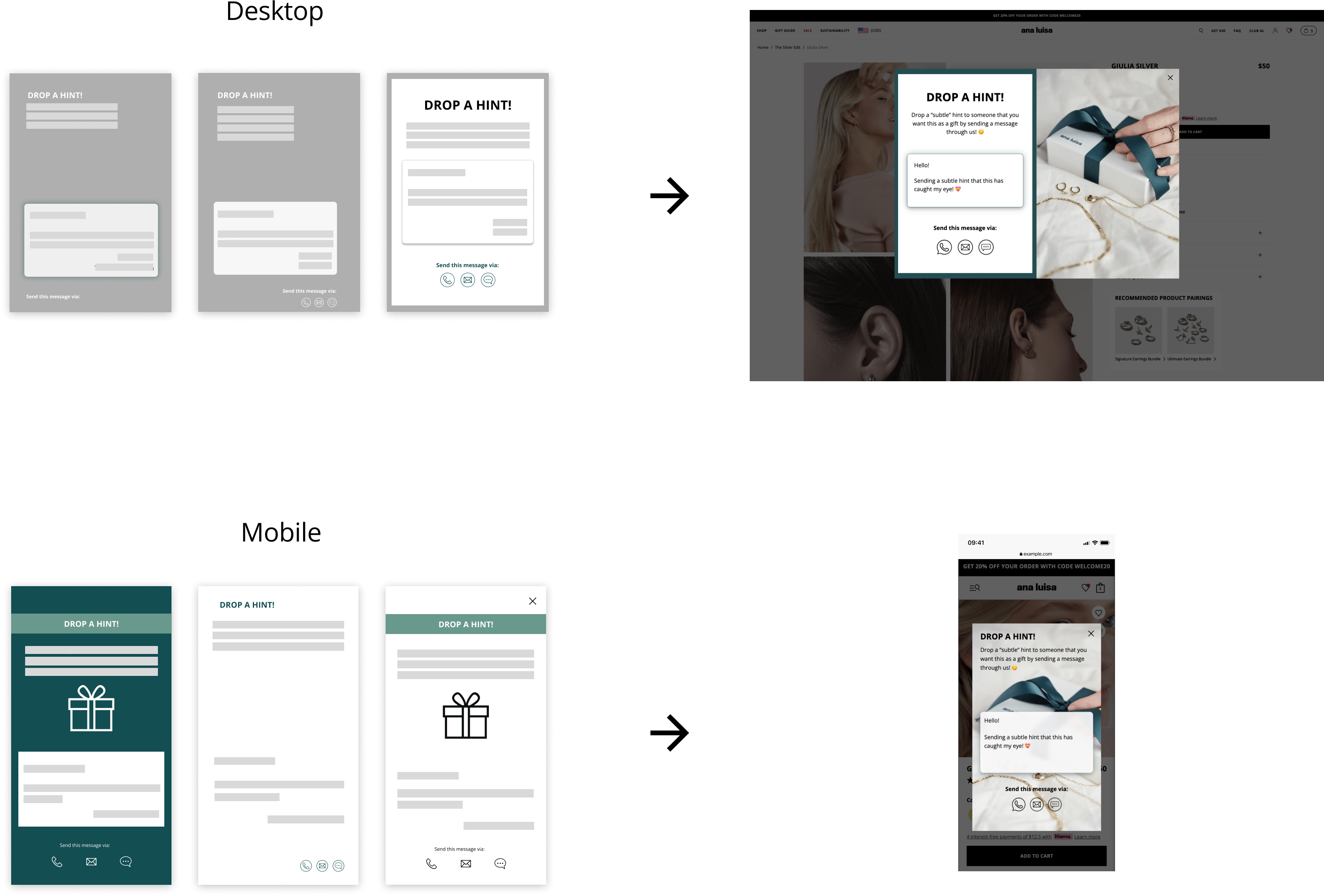
Pop-up Ad:
Our main goal of the pop up was to simply put- make it pretty. Because the content has been scattered methodically around the website on high touchpoint areas, we aimed for a visually grabbing pop up. We had to test a variety of placements and designs on order to match the holiday graphic being used. Teaming up with the creative team was the most creative process of this project (bad joke- ha).
LEARNINGS